
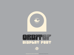
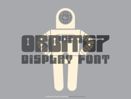
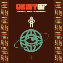
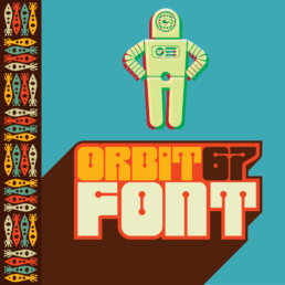
Orbit67 – A Cosmic Display Typeface
Orbit67 is a custom display typeface built for bold visuals and retro-futuristic storytelling. Inspired by mid-century sci-fi, atomic age optimism, and the rough edges of analog print, this type project explores how character-driven fonts can help elevate identity systems and IP development.
The Idea/Objective
To create a bold, display-driven typeface that balances strong visual character with technical precision — offering unique letterforms that feel fresh without sacrificing readability. The goal is to build a type system that serves expressive branding, headline treatments, and editorial use, while maintaining structural consistency, visual rhythm, and typographic integrity across styles and alternates.
Function vs. Personality
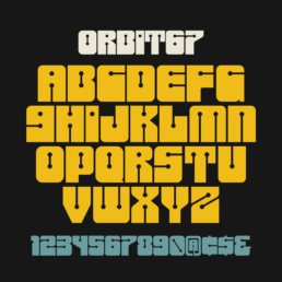
From the beginning, Orbit67 was built on a dialogue between hard structural lines and circular accents. These weren’t just decorative touches—they were core to the font’s identity. Every circle, whether nested in a stem, replacing a terminal, or shaping a counterform, followed the same proportion and alignment rules throughout the set. That consistency gave the typeface a visual rhythm—a sense of orbit, even.
The straight lines established clarity and structure, while the repeated circular forms softened the rigidity, adding a signature detail that could scale across every glyph. Together, they created a modular language—one that felt intentional and unified, even in its bolder, more expressive letterforms.
By adhering to this core logic, each character became a variation on a theme—distinct, but unmistakably part of the same system.
This one was a lot of fun to build.
Orbit67 features blocky, geometric letterforms anchored in solid structure, giving it a bold and grounded presence. To counterbalance the rigidity, circular accents—like curved terminals, rounded counters, and smooth joints—were strategically integrated. These circular forms inject a sense of motion and retro charm, adding playful personality while enhancing visual rhythm.
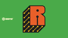
It all started with an “R.”
That letter was ground zero—the first experiment. I began with a simple structural form to see if I could integrate my signature circular accent into the vertical beam. Once that worked, the entire direction became clear. The “R” wasn’t just a letter—it was a proof of concept. From there, I carried the experiment through the rest of the set, building a system where solid geometry met curved detail, giving the type its unique rhythm and voice.
This one was a lot of fun to build.
Because it followed a more systematic approach, I was able to develop a graphical framework early on—something I could reference and evolve consistently across the entire set. That structure gave me freedom: a visual language to work within, but also enough room to experiment and inject personality into each form.
Objective
Build a fun bold type with a character driven set with multiple uses.
Outcome
A versatile display font that can be used across print, web, video and any other medium your imagination can find a use for.