YardHeadzA Playful And FunIllustration Project for Halloween
Illustration Project
About us
Fun for the whole family
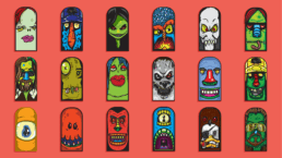
ALL THE HEADZ WERE DESIGNED WITH THE IDEA OF FUN COLORFUL HEADSTONE SHAPED APPEAL. THEY WERE DESIGNED TO BRING A BIT OF ENERGY TO HALLOWEEN DECORATIONS.
YardHeadz | Stick Your Head Out
Headstone Shaped Headz
I toyed with the idea of HeadStonez as well and in hindsight the name does have a more direct relationship, but I wanted the yard aspect to be the main idea, so i went with that. Flip a coin.
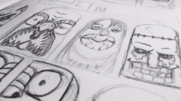
The ideas behind Yardheadz started as very loose sketches — and that looseness was intentional. I wanted the drawings to feel raw and freestyle, unhindered by overthinking or tight structure. The goal was to capture a spontaneous, playful energy that gave each character its own quirky charm, allowing instinct and imperfection to guide the design process.
A Logo ties it all together.
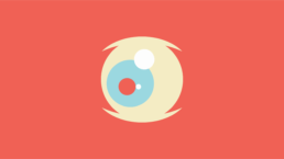
The YardHeadz logo was built around the concept of the cyclops — a bold, iconic monster that added personality and visual weight to the brand. I chose the cyclops as a central design element because it felt playful, memorable, and aligned with the illustrated monster theme. It gave the logo an extra layer of character while tying directly into the world of YardHeadz.
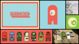
From playful painting to a realized concept.
What began as a few quick sketches and a handful of paint slowly evolved into a more polished, intentional brand experiment — blending playful illustration with character design and visual storytelling.
The Eye of the Beholder.
The graphic symbol that tied everything together was the eye. It became a guiding light in the development of Yardheadz — a simple, singular form that captured the essence of the project. The cyclops eye served as a metaphor for the monster persona: watchful, weird, and unmistakably iconic.
