
"Built to Scale: Smart, Simple Branding for Market Entry"
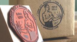
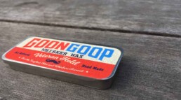
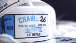
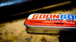
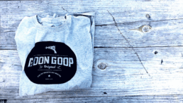
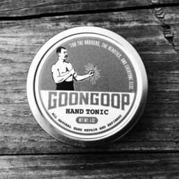
The Goon Goop brand embraces a no-frills, functional design system inspired by classic utility. A modular grid layout, bold typography, and a muted industrial palette. Monospaced accents, simple stickers, and rubber stamps add scalable personality, reinforcing a rugged, repeatable aesthetic. It’s skincare designed like a tool—structured, direct, and built to work without the fluff.
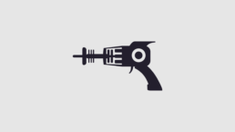
Ray Gun FunZapp! Zapp! Zapp!
The ray gun icon adds a nostalgic spark and taps into the inner child—a small, playful touch that softens the brand’s rugged, no-frills design. It brings a sense of charm and imagination to an otherwise functional system, reminding users that good design can be serious and still have fun. Simple, bold, and memorable—just like the things we loved as kids.
"The Swiss Army Knife Approach to Design"
When working on any project, you can use simple tools—like stamps, stickers, icons, or screens—to build effective, memorable brand elements. With a bit of creativity, these low-cost assets can shape the look and feel of your brand, helping it grow with consistency and personality. You don’t need complex systems to make a brand work—just smart use of what’s already at your fingertips.
"Resourceful by Design"
Strong branding isn’t about having endless resources—it’s about seeing the creative potential in the tools already at hand. Thoughtful use of available elements can shape a brand that feels intentional, elevated, and cohesive. Constraints aren’t limitations—they’re opportunities to build with clarity, purpose, and originality. The result is a brand that’s not just well-made—it’s well-considered.